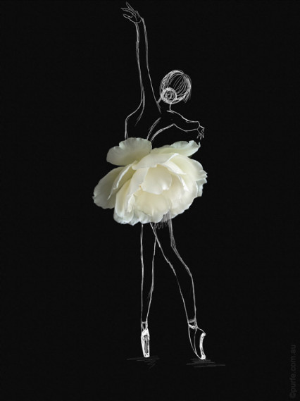
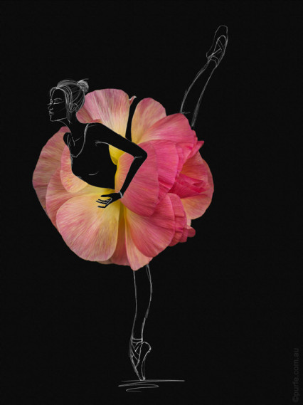
Sometimes it is enough to spend an afternoon in a garden to get a bunch of new skirt ideas.
Fashion, design and perfect fit
Sometimes it is enough to spend an afternoon in a garden to get a bunch of new skirt ideas.
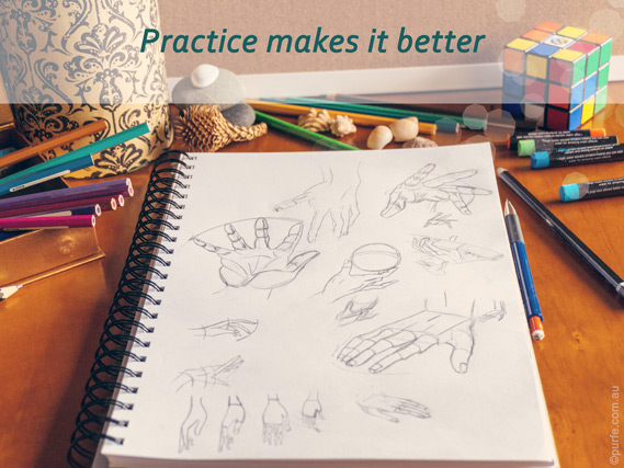
Huge colourful fashion drawings laying around on big white tables in the best design studios with your initials in the corner. Who did not have this thought flashing by while starting up on their next masterpiece? Great looking works definitely enhance portfolio of any artist and gets the focus on the main part, the idea. The path to get there is simple — practice. Here are some suggestions on how to get to that next level.
Thankfully for me and anyone out there looking to improve there is a wonderful tutorial by Mike Koizumi. It is a step by step explanation of how to draw hand from different points of view. Moreover, it provides a nice tip on how to draw a hand from every imaginable angle.
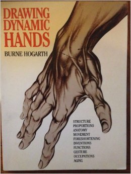
For more in-depth knowledge of hand’s anatomy, the ways they can help to express the mood, emotions and meaning of fashion illustration or fashion collection I suggest to read the classic book Drawing Dynamic Hands by Burne Hogarth. This is the most comprehensive book ever published on drawing hands, definitely must read!
You may also like to read about:
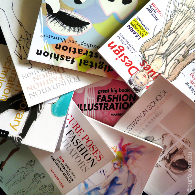
Top 5 Fashion Illustration Books
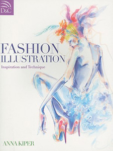
Fashion Portfolio: Design and Presentation by Anna Kiper
I know it can be very frustrating to have a fantastic idea and not be able to put it on a paper equally brilliant.
In this post I suggest some good fashion illustration books that will help to put your idea where you thoughts are.
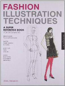 If you need fast results and have no time to comprehend body anatomy in details, go for Fashion Illustration Techniques: A Super Reference Book for Beginners by Zeshu Takamura. With a bit of practice, you will be able to draw a decent fashion figure in a week.
In this book, Zeshu Takamura introduces original figure drawing technique which is considerably different from the European art traditions. There is no complicated anatomy, just step by step guide: easy to follow and to produce invariably good results.
Apart from featuring sufficient amount of model poses, the book also covers almost all subjects an amateur fashion artist or designer will need. It includes textile rendering techniques, chapters of depicting fashion flats (technical drawings) and clothing, explicit “drawing from the photo” tutorials as well as loads of tips and tricks to give a sketch more professional look.
| At a glance | |
|---|---|
| Body measurement system | 8 heads |
| Illustrating men | |
| Illustrating children | |
| Colouring and fabric rendering techniques | |
| Exploring media | |
| Drawing fashion flats (technical drawings) | |
| Figure stylization | |
| Drawing from a photograph | |
| Drawing accessories |
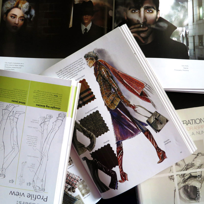
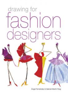 This brilliantly illustrated compendium
 hits a broad range of topics from drawing a croquis to developing a collection. It describes how to gather and organize sources of inspiration, to alter a portfolio and illustrations to industry standards, or to perform market research and meet the expectations of the target group and much more. Though some subjects are covered in brief with not many details I still recommend this book for a number of good reasons.
Reason number 1 is the chapter “Selection and use of materials”. This section is a great time-saver as it contains many helpful tips for applying various paints and brushes on myriad types of paper (I don’t even think that there are so many of them!). Also, it explains in detail which medium to choose for the desired result. Whether we’d like to resemble a printed illustration with clean outlines and opaque colours or wish a gentle transparent look for the drawing.
This book is one of the few that pays great attention to depicting the dressed figure. In the same fashion that many authors study the construction of the human body Angel Fernandez and Gabriel Martin Roig examine the anatomy of folds and drapes, as well as the difference between drawing bias and grain cuts. These explanations are priceless!
Distinctive style, author’s manner is the main difference between a professional illustrator and an inexperienced one. However, not many books include a guide on how to develop it. Drawing for Fashion Designers reveals main principles that can help to develop a unique style and express the design idea in full.
| At a glance | |
|---|---|
| Body measurement system | 8, 9, 10 heads |
| Illustrating men | |
| Illustrating children | |
| Colouring and fabric rendering techniques | |
| Exploring media | |
| Drawing fashion flats (technical drawings) | |
| Figure stylization | |
| Drawing from a photograph | |
| Drawing accessories |
I absolutely love this book!
 This book is brilliant. It does not have a comprehensive point by point tutorials, you will not find much about the anatomy or the use of painting materials, but it is good!
Filled with colourful and vivid drawings the book unfolds the subject of fashion illustration in exiting and artsy way.
I recommend it for everyone who enjoys drawing fashion illustrations. You will have fun, and even more if you have prior experience in drawing.
So if you are after brushing up the drawing skills – Anna Kiper’s Fashion Illustration: Inspiration and Technique is worth to read.
If I may draw a parallel between fashion illustration and cook books I’d say that while Zeshu Takamura’s Fashion design Techniques is like step by step recipe book, Anna Kiper’s Fashion Illustration is more like compendium of colourful food photography and decorating table ideas. Being very laconic it features abundance of stunning illustrations, so it doesn’t matter that there are so little words, it leaves more space for designs.
This is surely a kind of book you would want to go through few times scrutinizing details and apprehending the way drawings were made.
| At a glance | |
|---|---|
| Body measurement system | 10 heads |
| Illustrating men | |
| Illustrating children | |
| Colouring and fabric rendering techniques | |
| Exploring media | |
| Drawing fashion flats (technical drawings) | |
| Figure stylization | |
| Drawing from a photograph | |
| Drawing accessories |
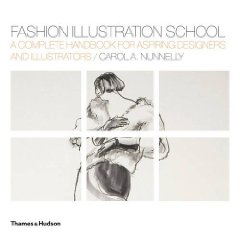 The book
 focuses on the traditional drawing topics from the figure basics to drawing flats.
Carol A. Nunnelly deploys a great variety of poses and positioning within her book. She also introduces the body mapping concept of drawing garments on figure which I found extremely helpful.
However, the book could be much better if the chapter of texture rendering were a bit more carefully arranged. Now it looks oversimplified.
| At a glance | |
|---|---|
| Body measurement system | 9 heads |
| Illustrating men | |
| Illustrating children | |
| Colouring and fabric rendering techniques | |
| Exploring media | |
| Drawing fashion flats (technical drawings) | |
| Figure stylization | |
| Drawing from a photograph | |
| Drawing accessories |
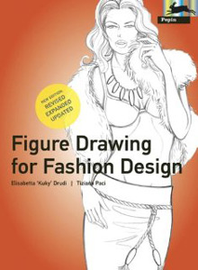 If Fashion Design Techniques by Zeshu Takamura is a step by step recipe book, Anna Kiper’s Fashion illustration. Inspiration and Technique is an inspiration book, Figure Drawing for Fashion Design
 is definitely a reference book.
It can be very helpful both for novice and seasoned illustrators, and all of those in between.
This comprehensive course on drawing fashion figures lays good foundation to work with and provides the most sufficient way to draw a large variety of fashion elements: from any part of the human’s body to clothing and accessories. It is really helpful as reference while depicting various poses and body movements.
Though teaching the basics is accompanied with extensive detailing which may seems to be superfluous for ordinary fashion sketch, I’m sure extra knowledge won’t hurt. At least you would know where to find it where you need it later on.
I have the first edition of the book dated 2001. Some reviews complain it was systematized and lacks clearness jumping from one subject to another. This was one of the reasons for the second version to see shop shelves in 2010. Now it is believed to be greatly expanded and updated. Also it seems to be more structured and logical then first one. I think there is nothing wrong with older version if that’s what you can get.
| At a glance | |
|---|---|
| Body measurement system | 8, 9, 10 heads |
| Illustrating men | |
| Illustrating children | |
| Colouring and fabric rendering techniques | |
| Exploring media | |
| Drawing fashion flats (technical drawings) | |
| Figure stylization | |
| Drawing from a photograph | |
| Drawing accessories |
At the end I’d also like to mention Figure Poses for Fashion Illustrators. 250 Templates for Professional Results by Sha Tahmasebi.
The title reflects it all. There are 250 royalty free templates featuring different poses in the book as well as some basic information on the subject of drawing. All poses are duplicated on CD as .tif and .jpeg images.
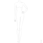
While reading these books and trying different techniques I made some croquis of 9 head models.
They are free to download and can be used for individual purposes or as reference to your own illustrations (Attribution-NonCommercial License). Looking forward to see your designs!
 |
 |
 |
|---|---|---|
| Front pose | Hand on hip pose | Diagonal pose |
One of the most frequent problems in creating contrast in an outfit is putting together garments with no obvious connections. Items with opposite characteristics placed next to each other often produce excessive contrast which can not only be bold and unflattering but also disintegrate the outfit’s composition. For example, neon-green chiffon skirt and lemon yellow bulky jumper quite seldom will be a part of a balanced look on their own.
When an outfit consists of unrelated and disjoint colours, textures or patterns, to unify them it’s essential to make a “bridge”, create an intermediary. Its purpose is to strengthen the connection between garments and create a complete story. It’s predictable that to be effective this “bridge” item requires similarity with the elements which are meant to be linked.
Areas of intermediary’s use are usually identical with fields of contrast. Thus, if we use two unrelated colours to create a contrast it will be logical to balance it out by another element of colour. The same is true to patterns or textures. Let’s go into details for each of them.
Colour is the most usual area for applying an intermediary.
The harmony of two different colour temperatures could be created with an intermediate that will tie the opposites.
A brief example can be seen in the sketch below. The top and the skirt are from different colour families – cold and warm. Together they look discordant and even conflicting. It is obvious that a link is needed. By bringing in shoes that support the pattern of the top and skirt’s hue the puzzle is solved and outfit regains its lost harmony.


Adding the intermediary softens the contrast and creates a perceptual bridge between two colours. For example, red and green could be linked by brown-red or brown-green as they are the exact colours that will come out if red and green are mixed.

In the picture below the top and the skirt on the left create sharp dramatic contrast which overbalances girl’s gentle complexion. Following the same trail that helped us to unite hues before, we rely on the intermediary item. Here we introduce a jacket which adds third tonal characteristic and brings the look closer to perfection.

This is the second area where the intermediary could be used.
Selecting in-between patterns requires a bit more sartorial funds as patterns consist of many different elements meant to be coordinated. In one of my previous posts, I have explained the levels of pattern mixing. Therefore, I will only touch on the topic of setting an intermediate.
To improve the look’s aesthetic “bridging” patterns should resemble those already in use. The similarity could be either in the style of lines, chromatic characteristics, or other levels of pattern coherence.
For example, if we combine geometric print with intricate abstract design linking pattern might remotely resemble both of them.

As I have mentioned before there are no common rules for texture mixing. However, the transition textures are expected to have similar attributes to those already in use.
Shapes and volumes seldom require an intermediary. It means, as long as common sense is taking into account, it is difficult to make mistakes in this area.
As you have already noticed the process, of “linking” parts of an outfit is not a subject for sweeping generalizations. It is not easy to set strict rules and provide common instructions to follow. All I can do is to outline the problem and set the trend of thoughts. The rest is entirely up to you.
I’m sure if a person knows about relations between elements described in this article they will tend to pay a little more attention to the sophisticated ritual of dressing. That will certainly produce noticeable and pleasant changes.
You may also like to read about:
Cherry on the top or contrast principle
The Timeless Principles of Pattern Mixing
Basic Principles of an Outfit Layout: Focal Point
While putting an outfit we aim to create a composition where all details are in their place and the whole look is complete and pleasant to the eye.
There are a number of subjects to keep in mind when arranging a composition. The important one that I would like to talk about here is contrast.
The abstract idea of contrast is one of the fundamental principles of our Universe. Mountains and plains, oceans and dry lands, positive and negative charges, high and low pressure – they are all contrasting in their state or force, and it is through this interaction the word exists.
Recognising contrast is natural for humans. We differentiate objects because they are contrasting , we use this difference as a reference point.
For example, Eiffel tower (300m high) is quite lofty for an average human, but it is dwarfed by Burj Khalifa building (828m) in Dubai when two are put together.
Back to the subject of clothing. Being curious human beings it is our second nature to look for new experiences. A visually interesting item in this regard would be something that induces our eyes to explore or as Diane Vreeland put it: “The eye has to travel”.
Introducing layers of complexity into the look by adding various textures or using multiple colours gets our attention. Put it another way, contrast is used to enhance an outfit by giving tedium an appeal, a life buoy, reducing the repetitive impact.

Ideally the difference of brightness in an outfit should be in direct relationships with wearers’ complexion. What I refer to here is the natural contrast created by skin, eyes, and hair tones. The more contrasting features woman has the wider brightness range in garments she could afford to wear. And on the contrary, the less contrasting appearance demands for the lower brightness contrast in clothes.
Back in the real world, the illustration below shows outfits made in contrasting colours. The sangria and blue dress on the left have low brightness contrast while the pink one at the right is much lighter than the jacket and so it will do great on person with high contrast complexion.


For example big bag would appear even bigger if it is carried by a petite girl. Or, speaking about moods, imagine fitted stiff coat with bulky scarf thrown upon it. Strict lines of a coat are perfectly unbalanced by the casual style of the scarf.
The simplest way to make texture contrast is to use fabrics with straight opposite characteristics: glossy – matt, sheer – opaque, stretchy – firm and so on. There is, unfortunately, no proven recipe book on how to mix multiple textures. Some experimentation and observation of what works is a way to go here.
Few notes to consider about textures:
As you can see contrast is the ultimate attention grabber. It can work on many levels and is to be used with comprehension taking into account person’s style and personality.