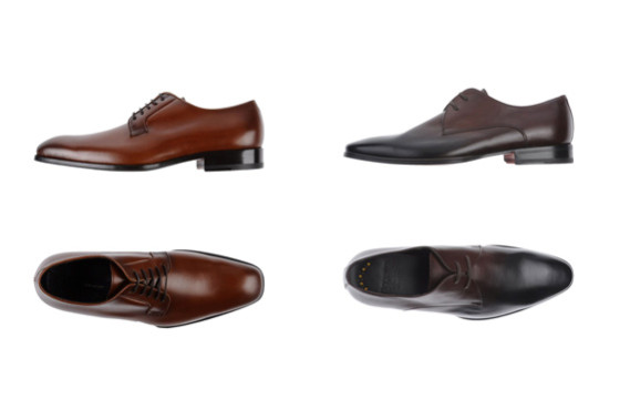
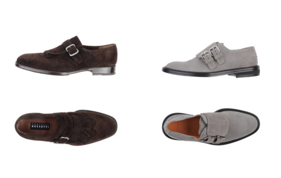
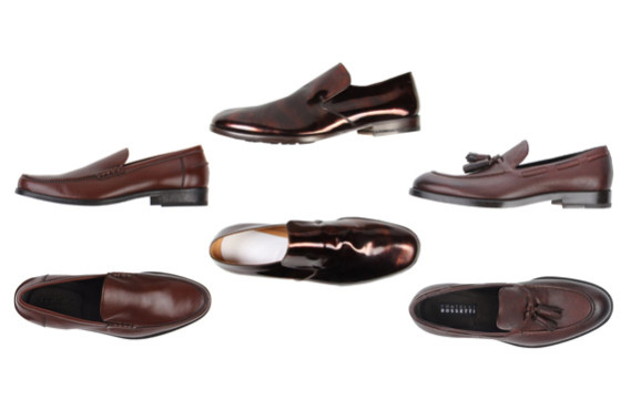
How often while putting together the outfit do you limit your use of colour to just a few or rely on neutral hues only?
We all know that choosing colour palette for an outfit could be a time consuming process. A lot of heroic attempts to conquer the colour reel end up going back to a simple traditional combination or, at worst, looking like an over-decorated Christmas tree.
I suppose, perfect sense of colour is possessed by relatively small amount of people, rest of us (myself included) have to content with our own sense of beauty, intuition and, at best, with some knowledge of the colour theory.
There is no doubt that understanding either consciously or unconsciously the basics of the colour theory is essential for creating a balanced set.
To successfully use different hues in an outfit your own personal preferences will need to be in an agreement with certain rules. However, all these rules for creating colour schemes, hierarchy of colours, colour discords, value keys, etc. require a significant investment of time.
Working with my clients I often feel a need to explain principles of colour mixing in brief, so they will be able to use it in real life. Theory itself is a bit dry and I found a good approach that is much easier and more fun.
Extra bonus, it’s handy for other colouristic tasks like composing flower bouquets, choosing napkins for dining room or creating a landscape design for the backyard. It is very versatile and can be a great tool for finding unusual yet pleasant colour combinations.
It is easy, intuitive and always works. Well, you‘ve got an idea, let’s get to it now.
What is it all about?
Did you know that designers quite often set up their colour palette from a single picture?
We can do the same. That’s where landscape photography could be a great source of inspiration. Think of the picture as a set of colours that are combined into a single composition.
Intrinsically, people tend to perceive all nature combinations as harmonious. The nature knows exactly which hues and in what proportions to use to create a masterpiece. To illustrate that, let’s take a classic sample of 2 complement colours such green and red. They are rarely used next to each other as put together they produce maximum vibrancy. However, when we see a strawberry garden patch or big flowerbed covered with red poppies it is always pleasant to the eye, isn’t it? The secret lies in proportions! Let’s get to the practical examples of how that can be used.
How it works?
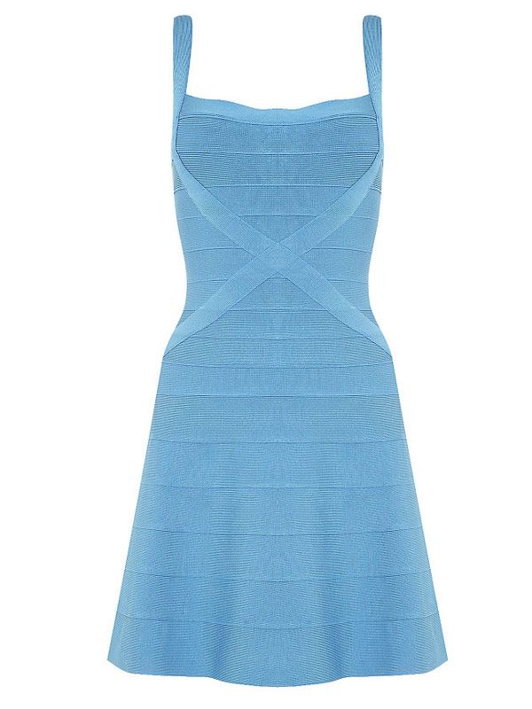
Say, we have a sky blue dress and would like to find a perfect pair to it.
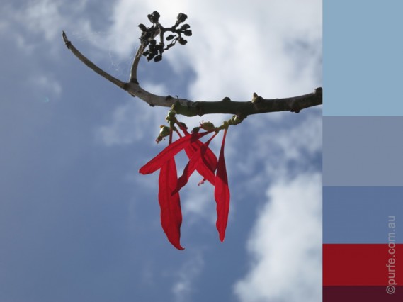
Now, let see if we can find something that will give us an idea of what colours could work here. While browsing my personal collection I came across a beautiful photograph of the autumn sky. It is much the same colour with the dress and is opposed by strikingly bright red leaves. Blue and red combination does not look too bright here, on the contrary, it looks well balanced.
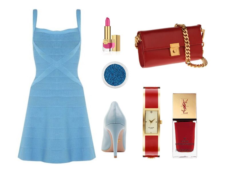
With this in mind we can start to assemble the outfit looking for reds and different shades of greys. Let’s start from very light and pale (Battleship Grey like clouds) and continue to deep grey, a tree’s branch-like colour. There is no need to use all colours in one set, just choose a few.
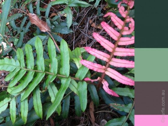
Another example is inspired by marcescent fern foliage.
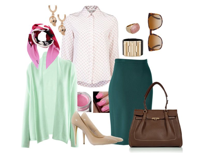
Combination of green and pink is quite vernal and dynamic and might be too much for an office dress code. Paying attention to proportion, intensity and hues of mixing colours, however, we can get quiet and restrained look with subtle allusions of wearer’s energetic personality and good taste.
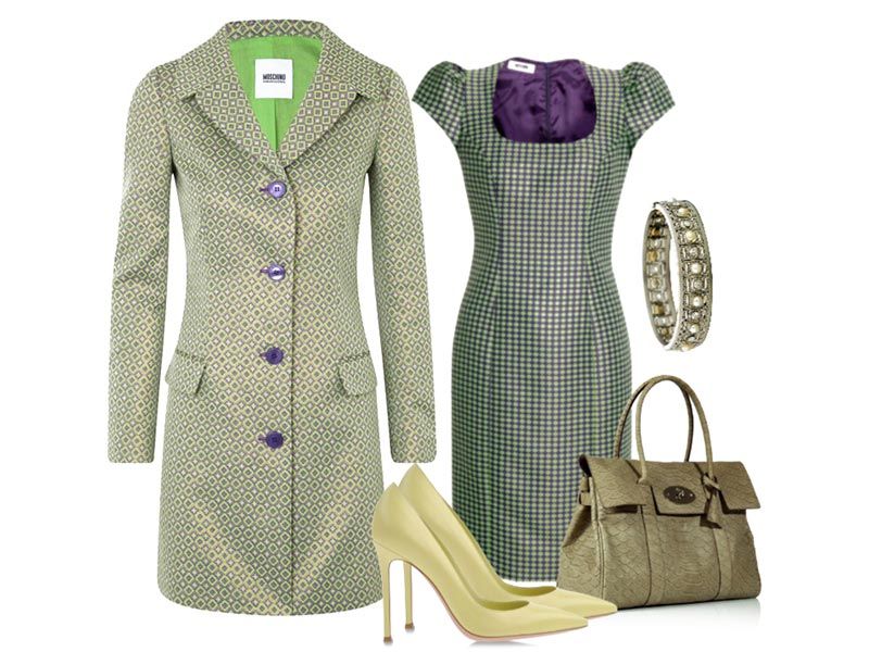
The third set is monochrome one.
It is generally assumed that putting together similar hues is the safest way to create a nice looking attire, when in fact, even a small detail, such a wrong colour temperature of one piece, can offset the whole balance.
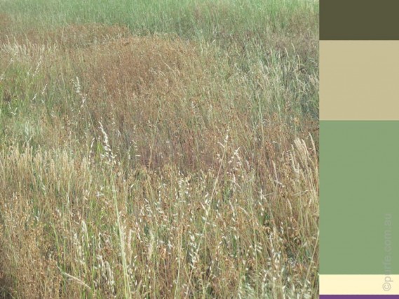
Thus, to set a mind in the right direction we will use a picture with subtle colour differences for inspiration, as the one of a summer meadow below.
You can see it incorporates not only different shades of green and brownish-grey, but also tiny amounts of purple and yellow which are perfect as accent colours.
This is another great benefit of analysing photos, it gives proven examples on how to use more than 3 colours, an area which usually requires experience and good knowledge of colour theory to get it all right.
As you can see, you don’t need to go far for inspiration and for the tools to create a well-balanced colour palette. It’s all within a hand’s reach, be it a bouquet of wild flowers or a Google search.
There are some great web-sites that can generate colour palette from images on-line. You can also search through existing palettes for inspiration and hints. My favorite one is COLOURlovers with it’s vast range of palettes and patterns.

