The Timeless Principles of Pattern Mixing

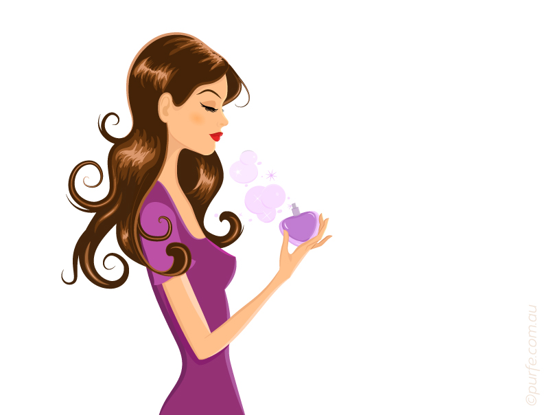
Every season style blogs are filled with reports of trendy prints and the ways to mix them for the perfect outfit.
There is a myriad of tips like “Look for patterns that complement each other” or “Limit patterns to two” and even “Leopard goes with everything.”
These might be great examples of what works, but in this article I will cover the logic behind it, why it works. And why it doesn’t when it doesn’t.

“So, what principles considered the base of a perfect pattern combination?” you might ask.

First of all, in a well-designed outfit you would straightaway notice the strong, active print (or a color, shape) that sets the theme. The other details are working to reinforce that. An outfit needs to be structured to make it easier for the viewer to perceive the parts of composition. A glance will go to one part after another, starting from the most active (accent) to the quietest and neutral one creating the feeling of agreement and consistency.

That’s why an outfit that contains two or more identically intensive patterns causes visual confusion. The observer will be switching between them unable to identify the main and the subtle one.
fashion illustration of top and skirt with equally intensive patterns

Two identically intensive patterns

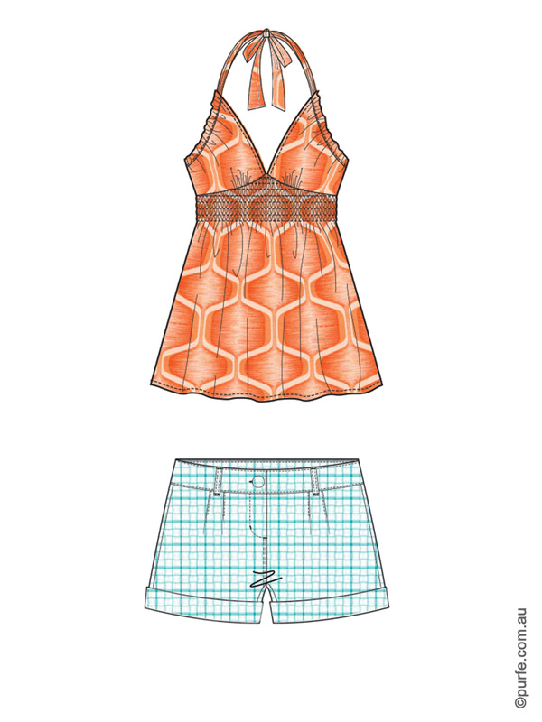
At first glance the garments above are combined according to the basic rules of mixing patterns. The scale is right – polka dot on skirt goes well with large circles of the top. The color combination is fine, complementary hues are used. But something just doesn’t feel right, isn’t it?

That’s because they doesn’t follow the main principle of print mixing: to achieve the harmonious look patterns should be of different intensity.
Below are the rules that will help to identify which of two patterns is dominant.

The balance in pattern mixing could be achieved through

Levels of pattern coherence:

  • Size. Bold patterns are dominant over fine ones. That’s why they say “pair same patterns in different scale”.
    fashion illustration of top and shorts with different scaled floral patterns
    Colorful floral print mixed with subtle organic pattern

  • Complex (structured) forms dominate over simple ones – paisleys are usually more eye-catching then dots. Other examples of potentially active prints include bold florals, detailed damasks or compelling geometrics.
    fashion illustration of floral jacket and polka dot skirt
    Jacket’s floral print is more complex so it becomes the centre of attention for this set

  • Color saturation. Pure hues are more prominent then gradations – pure red stripes are more eye-catching then maroon ones.

  • Color temperature. Patterns in warm hues dominate the ones in cool.
    fashion illustration of orange top and light blue shorts
    The warm orange top is dominating blue shorts

  • Color intensity. Tints dominate shades, the lighter color is getting the attention first.
    fashion illustration of dark top and light coloured skirt
    Light-patterned skirt paired with dark top

  • Contrast. High contrast objects look more fascinating then low-contrasting ones.
    fashion illustration of high contrast hounds tooth jacket and low contrast floral skirt
    Hound’s tooth jacket has higher contrast and dominates skirt

    These rules of pattern mixing work well considering all other characteristics are equal. In other words, between two patterns of equal size the lighter one will dominate. Between warm and cool ones of similar brightness conspicuous will be the one which is more pure and “warm”. Few visual examples below:

    fashion illustration of jacket slightly darker then skirt fashion illustration of two tops of the same design with different patterns
    Here are two organic prints both of a similar size. The dominant one is a skirt as it appears lighter

    Out of these two patterns zigzags are more noticeable due to a higher contrast and more complex geometry

    Q: If we have two dramatic patterns of a similar color shade and tone, would it be possible to wear them together and still have a balanced look?
    A: The answer is yes.
    Q: In that case which of them will be accent?
    A: Neither. Our vision is very good at noticing objects that stand out. Have one butterfly printed on the shirt and it will be the first thing everyone will see. Have a hundred of them and a tomato sauce stain and guess what people will look at. Same is here, we would need something to stand out. It could be plain color or accessory, e.g. nude shoes, a tan leather bag or big brown sunnies.

    Now, let’s get back to the example described at the start of the article and think how we can fix it.

    fashion illustration of top and skirt with equally intensive patternsprevious illustration with switched colour on patterns

    The set on the left feels a bit “undecided”. And indeed, it breaks the main principle of mixing patterns of different intensity. The polka dot, in spite of its size, is conspicuous by color while top’s circles dominate by size. So these garments are disputing on the level of color and scale. Two active prints are clashing and cause viewer “to jump” from top to skirt and back again while being unable to decide which of them has the priority.
    If we simply swap the colors, – make a polka dot pattern in shaded blue, and circles on of the top in pure red, the harmony will be achieved. Now bigger and warmer print has full control over the smaller and cooler one.
    In real life where we cannot easily change the color of our clothes (tomato sauce aside). I would then suggest to find another pair to either skirt or top. Or, try to add the accessories to improve the look. More shopping to be done in any case!
    fashion illustration of top and skirt with equally intensive patterns with accessories supporting one of them

    It may seem difficult at first to keep all these things in mind. But it’s like learning to drive a car. When you first get behind the wheel you are overwhelmed by all the tasks you need to do at once: following the rules, checking the signs, keeping the speed and changing the gear (if you unlucky enough to have a manual). Once you get a bit of experience it becomes too simple. Suddenly you are a pro driver ready to show anyone few tricks, think you can do it with one hand while drinking a coffee with another. At the end, it is all about few simple rules and a bit of practice.


    You may also like to read about:
    How to Coordinate Colours in Outfit, Designer’s Method

  • Best Graphics Tablet for Fashion Illustrations

    Today’s post is inspired by my new purchase and it’s not a dress or pair of shoes. It is graphics tablet Wacom Intuos5.

    So if creative process is a big part of your life – read on! I will share with you my experience and tell why I think it is great tablet for fashion illustrations as well as drawing or photo processing.
    Wacom Intuos5 graphics tablet

    Design

    The first best thing you would notice is design.

    It starts with packaging. The Intuos presented beautifully with all components elegantly arranged into a compact box. There is no messy foam and plastic wraps. First impression is definitely a good one.

    Visually, the tablet would satisfy a demand of the most particular connoisseurs. Its minimalistic, slick and lovely design certainly adds inspiration to my creative process.

    It comes in black which goes well with almost everything (and reminds me of LBD congeniality). Its matt soft-touch finish adds a certain degree of sophistication and has a very practical function of preventing fingerprints left on the surface.

    Ultra-thin ergonomic design allows palms to rest on the top and to draw comfortably for hours. And I know that, because I can hardly keep my creative impulses without spending hours trying them out.

    Seamless buttons complement polished look and make the cleaning process swipe of a deal. Rest easy those who resorted to throwing their keyboard into the dishwasher. With Intuos you just need to remember to not put your coffee cup on top.
    Wacom, Intuos5, graphic tablet

    Functionality

    When you first look at the drawing area you get an impression of a matt glass surface. When you first draw with the pen sensation is close to drawing on a grainy paper. And that feels awesome.

    Active drawing zone is highlighted by little glowing corners. I must say it is very handy to have that extra space around the drawing area. I can now feel free with sweeping strokes as there is less risk running pen nib off the edges.

    Device comes it 3 sizes and I would say medium (size of a small netbook) is perfect for home use and to carry around as well.

    The tablet is very intuitive (as name suggests) and extremely user-friendly. I’m not a tech gal, but software that comes with the tablet made setup fun and easy.
    Among the bunch of great features I really like are multi-touch input where you can rotate canvas with your fingers and ExpressKeys that you can set to most used actions (e.g. copy/pasting or switching brushes). The TouchRing is also a very useful thing to have for quick zooming.

    After getting a bit used to navigating and drawing with the tablet I tend to use keyboard less and less and that brings the creative process to a totally different level!

    The pen itself looks and feels like an ordinary pen. Sometimes I even get it confused with my favourite ballpoint. Amazing sensitivity, it responds to different pressure, tilt and feels very close to drawing on paper! I already mentioned that, I know.

    Below is one of my illustrations using Wacom Intuos5.
    Fashion girl with perfume bottle. Vector Illustration

    I’ve created some vector graphics and even that was more pleasant and easy on a pen tablet. Another reason to leave your mouse alone and do things differently?

    Conclusion

    Wacom Intuos5 lacks only one feature: it cannot make you draw better. But it certainly gets you to draw more!

    Where to get one

    If you are trying to find best deal on Wacom Intuos5 have a look on the Amazon offers. Wacom Intuos5 Touch Medium Pen Tablet that can be found there from $339*. Make sure you get “Touch” as there is a model without that functionality. Get a wireless kit for $36 extra as well if prefer to have less cables.

    For Australian residents PC Case Gear sells them for $305* or you might give Static Ice search a go to see who else is offering them locally.

    If you enjoy a bit of a technical details make sure to browse through official specs.

    *information is relevant to a time review was written and might’ve changed.


    You may also like to read about:
    5 Best Free Apps to Organize Your Wardrobe