Connecting Dots. The Importance of Intermediary in an Outfit

One of the most frequent problems in creating contrast in an outfit is putting together garments with no obvious connections. Items with opposite characteristics placed next to each other often produce excessive contrast which can not only be bold and unflattering but also disintegrate the outfit’s composition. For example, neon-green chiffon skirt and lemon yellow bulky jumper quite seldom will be a part of a balanced look on their own.

When an outfit consists of unrelated and disjoint colours, textures or patterns, to unify them it’s essential to make a “bridge”, create an intermediary. Its purpose is to strengthen the connection between garments and create a complete story. It’s predictable that to be effective this “bridge” item requires similarity with the elements which are meant to be linked.

Where to use?

Areas of intermediary’s use are usually identical with fields of contrast. Thus, if we use two unrelated colours to create a contrast it will be logical to balance it out by another element of colour. The same is true to patterns or textures. Let’s go into details for each of them.

Colour

Colour is the most usual area for applying an intermediary.

  • Colour temperature. It is a popular opinion mentioned on many style blogs that warm and cold hues should not be used together. While I agree this is a good general rule to avoid imbalance, the dots can still be connected.

    The harmony of two different colour temperatures could be created with an intermediate that will tie the opposites.

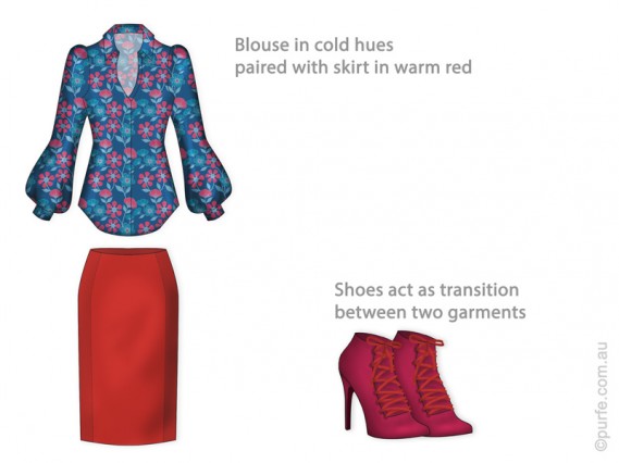
    A brief example can be seen in the sketch below. The top and the skirt are from different colour families – cold and warm. Together they look discordant and even conflicting. It is obvious that a link is needed. By bringing in shoes that support the pattern of the top and skirt’s hue the puzzle is solved and outfit regains its lost harmony.

    Dress shirt in cold hues paired with warm red skirt.

    Shoes as an intermediary for blouse and skirt
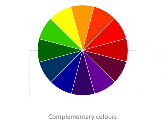
  • Hue. In the case of hue, the contrast is usually created by complementary colours. They are opposite on the colour wheel, therefore have nothing in common. Placed next to each other, they produce maximum vibrancy and contrast.
    colour wheel showing complementary colours

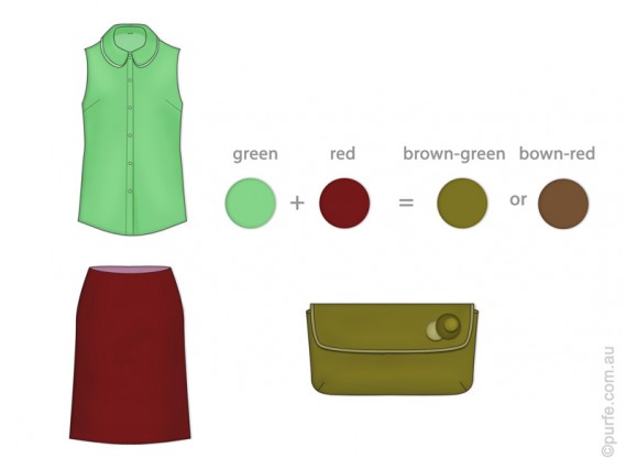
    Adding the intermediary softens the contrast and creates a perceptual bridge between two colours. For example, red and green could be linked by brown-red or brown-green as they are the exact colours that will come out if red and green are mixed.

    Complementary red and green linked by brown-green

    Red skirt and green blouse could be linked by brown-green clutch
  • Colour brightness. Too much difference in brightness can cause undesirable dramatic contrast. Employing in-between shades can help soften the look.

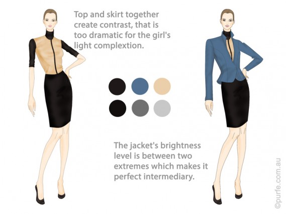
    In the picture below the top and the skirt on the left create sharp dramatic contrast which overbalances girl’s gentle complexion. Following the same trail that helped us to unite hues before, we rely on the intermediary item. Here we introduce a jacket which adds third tonal characteristic and brings the look closer to perfection.

    Jacket in in-between shades acts as intermediary for contrasting top and skirt

    Sharp contrast of top and skirt is softened with in-between-tone jacket

    Pattern

    This is the second area where the intermediary could be used.

    Selecting in-between patterns requires a bit more sartorial funds as patterns consist of many different elements meant to be coordinated. In one of my previous posts, I have explained the levels of pattern mixing. Therefore, I will only touch on the topic of setting an intermediate.

    To improve the look’s aesthetic “bridging” patterns should resemble those already in use. The similarity could be either in the style of lines, chromatic characteristics, or other levels of pattern coherence.

    For example, if we combine geometric print with intricate abstract design linking pattern might remotely resemble both of them.
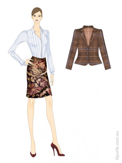
    Jacket as a "bridge" for differently patterned garments

    Striped dress shirt and floral skirt share nothing in colour scheme; their style of lines is also different. As intermediary, the plaid jacket incorporates skirt’s rich red-brown colour and shirt’s geometry

    Texture

    As I have mentioned before there are no common rules for texture mixing. However, the transition textures are expected to have similar attributes to those already in use.

    Shape and volume

    Shapes and volumes seldom require an intermediary. It means, as long as common sense is taking into account, it is difficult to make mistakes in this area.

    Final touch

    As you have already noticed the process, of “linking” parts of an outfit is not a subject for sweeping generalizations. It is not easy to set strict rules and provide common instructions to follow. All I can do is to outline the problem and set the trend of thoughts. The rest is entirely up to you.

    I’m sure if a person knows about relations between elements described in this article they will tend to pay a little more attention to the sophisticated ritual of dressing. That will certainly produce noticeable and pleasant changes.


    You may also like to read about:
    Cherry on the top or contrast principle
    The Timeless Principles of Pattern Mixing
    Basic Principles of an Outfit Layout: Focal Point

Cherry on the Top or Contrast Principle

Why is contrast important?

While putting an outfit we aim to create a composition where all details are in their place and the whole look is complete and pleasant to the eye.

There are a number of subjects to keep in mind when arranging a composition. The important one that I would like to talk about here is contrast.

The abstract idea of contrast is one of the fundamental principles of our Universe. Mountains and plains, oceans and dry lands, positive and negative charges, high and low pressure – they are all contrasting in their state or force, and it is through this interaction the word exists.

Recognising contrast is natural for humans. We differentiate objects because they are contrasting , we use this difference as a reference point.

For example, Eiffel tower (300m high) is quite lofty for an average human, but it is dwarfed by Burj Khalifa building (828m) in Dubai when two are put together.

Contrast and outfit layout

Back to the subject of clothing. Being curious human beings it is our second nature to look for new experiences. A visually interesting item in this regard would be something that induces our eyes to explore or as Diane Vreeland put it: “The eye has to travel”.

Introducing layers of complexity into the look by adding various textures or using multiple colours gets our attention. Put it another way, contrast is used to enhance an outfit by giving tedium an appeal, a life buoy, reducing the repetitive impact.

Contrast can be created in several areas

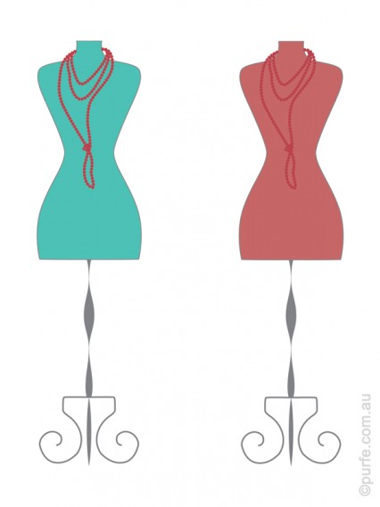
  • Colour. The same colour can look different depending on surroundings. It could be vibrant and bright next to complementary hue, or become subtle and dull whilst surrounded by analogous colours.
    Illustration of the same red necklace on contrasting and analogous backgrounds

    The same red necklace looks radiant and vivid on mint green background, but it mutes on cadmium red mannequin

  • Brightness is our perception of the colour luminance, how bright we see it. It is quite an interesting topic on itself, but I’ll explain it briefly below.

    Ideally the difference of brightness in an outfit should be in direct relationships with wearers’ complexion. What I refer to here is the natural contrast created by skin, eyes, and hair tones. The more contrasting features woman has the wider brightness range in garments she could afford to wear. And on the contrary, the less contrasting appearance demands for the lower brightness contrast in clothes.

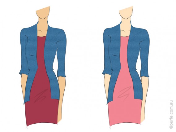
    Back in the real world, the illustration below shows outfits made in contrasting colours. The sangria and blue dress on the left have low brightness contrast while the pink one at the right is much lighter than the jacket and so it will do great on person with high contrast complexion.

    Two identical jackets paired with red dresses in different tones

    Steel blue jacket paired with equally bright dress (left) and lighter one (right)


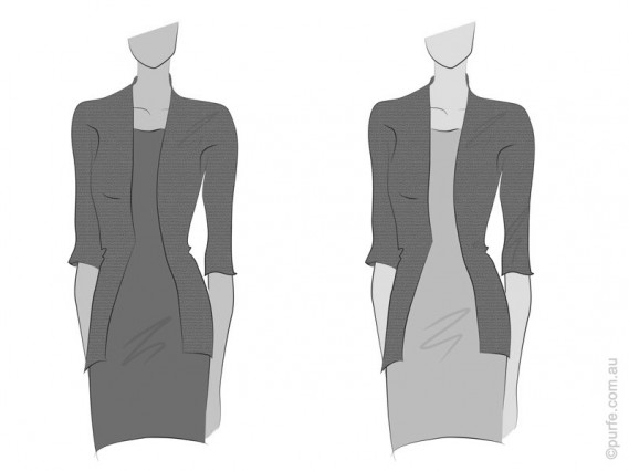
    Desaturated image above

    The desaturated image shows clearly the difference in brightness level between two sets

  • Shape (volume). Arrangements of shapes that are slightly varied and irregular tend to hold the interest of a viewer longer than those perfectly even. Different forms can not only produce different moods but can also create an optical illusion. Anything will look bigger surrounded by smaller objects. And vice versa.

    For example big bag would appear even bigger if it is carried by a petite girl. Or, speaking about moods, imagine fitted stiff coat with bulky scarf thrown upon it. Strict lines of a coat are perfectly unbalanced by the casual style of the scarf.

  • Texture. Creating contrast in textures is a great way to add an extra bit of interest and an elegant way show sartorial consciousness. It is a must for monochrome outfits. Whilst lacking the colour component the certain degree of excitement could be, nevertheless, created by using surface properties.

    The simplest way to make texture contrast is to use fabrics with straight opposite characteristics: glossy – matt, sheer – opaque, stretchy – firm and so on. There is, unfortunately, no proven recipe book on how to mix multiple textures. Some experimentation and observation of what works is a way to go here.

    Few notes to consider about textures:

    1. Various textures reflect light differently. Nap fabrics (like velvet, fleece and felt) make colours appear more rich and saturated because of their fuzzy surface. In contrary, smooth and shiny ones reflect more light. That creates gloss and bleaches the surface. Therefore, the same colour in silk will appear lighter than on velvet.
    2. Moreover, fabrics hold dyes differently. The colour on cotton gabardine will look a little bit lighter than on wool as wool tends to retain dye better.
      Even though lack of variety can be tedious, contrast should be used with care. Too much of it and there will be several focal points competing for an attention and affecting unity of the overall look.

    As you can see contrast is the ultimate attention grabber. It can work on many levels and is to be used with comprehension taking into account person’s style and personality.


  • Basic Principles of an Outfit Layout: Focal Point
    My recent post about relations of peplum and pants has touched an important principle of an outfit layout – the subject of a focal point.

    In fashion, like in art, focal point (centre of interest) is where the viewer attention is naturally attracted.
    Proficient arrangement of focal points can turn a plain outfit into a good one. It is a sort of visual magic when a scarf thrown over a shoulder resuscitates the entire look. The question is how do you know what trick to use where.

    Every garment independently of the outfit has its own centre of interest – it could be a collar, a pocket, a yoke, pleats, gatherings, you name it.
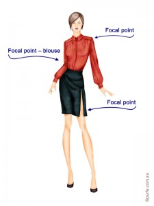
    On the image below the shirt catches the eye and it is the focal point of this look. But both skirt and blouse has their own centres of interest – it is a slit and a yoke respectively.
    fashion illustration of woman wearing red blouse with front yoke and skirt with slit

    So, in an outfit the focal centre can be:
    -a certain garment (blouse, T-shirt, shoes, shorts)
    -a detail or accessory (collar, pockets, sleeves, brooch, bangles, and necklaces)
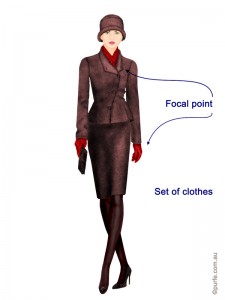
    -a set of clothes (hat and scarf, scarf and gloves, shoes and skirt)

    fashion illustration of woman wearing brown jacket and skirt paired with red gloves and scarf style

    There are 4 basic approaches to emphasise something as focal point:
    -by colour
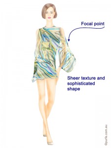
    -by texture
    -by shape
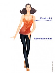
    -by complex trimming or other striking elements.

    fashion illustration of woman wearing silk dress with sophisticated sheer sleeves fashion illustration of woman wearing dark skinnies and bright top decorated with frills

    The number of centres in an outfit can vary from one to as many as desired as long as they are hierarchically coordinated.

    Multiple focal points add interesting complexity. The diversity and elegant balance of details get attention of viewers. Most of the times we don’t even know why, but we can tell there is something in that look.

    At the same time there should be a clear connection between individual parts of the design. They should be sending the same image message.

    The cohering elements of an outfit can be present on different levels. Every one of these is a big subject and deserves a topic of its own, so we’ll keep it simple here.

    -Proportion: consider how to vary placement of garments so they articulate strong message and the outfit has its centre of interest. The size of focal point must complement the proportion of the garment (e.g. you might not be the only one who thinks that a big bow on slim evening dress looks ridiculous).
    -Colour scheme: coherence on this level works best when one accent colour dominates the look and the others work to support and add interest to an outfit. Have another look on that red blouse above. That’s it.
    -Shape: sophisticated and irregular shapes cause strong sensory responses so they must be balanced within an outfit to avoid undesirable effect.A decorative blouse with plan paints works well.
    -Texture: textures influence our mood. We make assumption according to certain textures about age, personality, lifestyle, degree of sophistication. Textures are also perceived according to hierarchy. Smooth and glossy fabrics are catching attention first.
    -Pattern and decoration: some of them are active and dominant while others are not so strong.

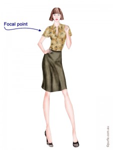
    Let’s have a look on the example. Below, a light patterned shirt is teamed with a plain skirt in matching colour. This outfit is well-adjusted on the levels of colour, pattern and texture. Here all the attracting attributes of each level belong to the shirt and that makes the look balanced. It might be, however, lacking a certain degree of sophistication, but that’s easily corrected by adding accessories.
    fashion illustration of woman wearing floral blouse and plain brown skirt

    Getting a balanced look is not an easy task as it may seem. But as most of things, you get it with a practice. A good rule of thumb here is: if you are uncertain about something just make it simpler. The safest way to mix clothes in an outfit is to start basic, use one focal point, or one accent.


    You may also like to read about:
    Connecting Dots. The Importance of Intermediary in an Outfit
    Cherry on the Top or Contrast Principle