Best Graphics Tablet for Fashion Illustrations

Today’s post is inspired by my new purchase and it’s not a dress or pair of shoes. It is graphics tablet Wacom Intuos5.

So if creative process is a big part of your life – read on! I will share with you my experience and tell why I think it is great tablet for fashion illustrations as well as drawing or photo processing.
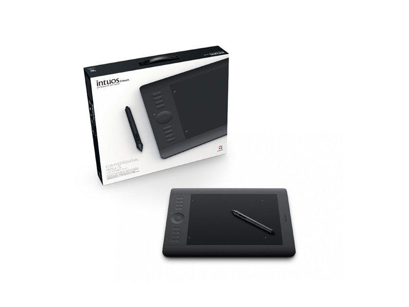
Wacom Intuos5 graphics tablet

Design

The first best thing you would notice is design.

It starts with packaging. The Intuos presented beautifully with all components elegantly arranged into a compact box. There is no messy foam and plastic wraps. First impression is definitely a good one.

Visually, the tablet would satisfy a demand of the most particular connoisseurs. Its minimalistic, slick and lovely design certainly adds inspiration to my creative process.

It comes in black which goes well with almost everything (and reminds me of LBD congeniality). Its matt soft-touch finish adds a certain degree of sophistication and has a very practical function of preventing fingerprints left on the surface.

Ultra-thin ergonomic design allows palms to rest on the top and to draw comfortably for hours. And I know that, because I can hardly keep my creative impulses without spending hours trying them out.

Seamless buttons complement polished look and make the cleaning process swipe of a deal. Rest easy those who resorted to throwing their keyboard into the dishwasher. With Intuos you just need to remember to not put your coffee cup on top.
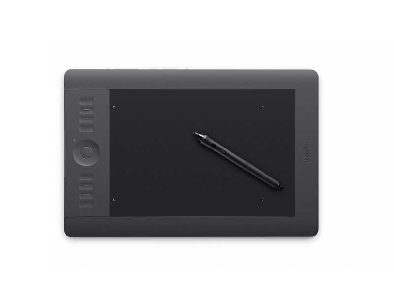
Wacom, Intuos5, graphic tablet

Functionality

When you first look at the drawing area you get an impression of a matt glass surface. When you first draw with the pen sensation is close to drawing on a grainy paper. And that feels awesome.

Active drawing zone is highlighted by little glowing corners. I must say it is very handy to have that extra space around the drawing area. I can now feel free with sweeping strokes as there is less risk running pen nib off the edges.

Device comes it 3 sizes and I would say medium (size of a small netbook) is perfect for home use and to carry around as well.

The tablet is very intuitive (as name suggests) and extremely user-friendly. I’m not a tech gal, but software that comes with the tablet made setup fun and easy.
Among the bunch of great features I really like are multi-touch input where you can rotate canvas with your fingers and ExpressKeys that you can set to most used actions (e.g. copy/pasting or switching brushes). The TouchRing is also a very useful thing to have for quick zooming.

After getting a bit used to navigating and drawing with the tablet I tend to use keyboard less and less and that brings the creative process to a totally different level!

The pen itself looks and feels like an ordinary pen. Sometimes I even get it confused with my favourite ballpoint. Amazing sensitivity, it responds to different pressure, tilt and feels very close to drawing on paper! I already mentioned that, I know.

Below is one of my illustrations using Wacom Intuos5.
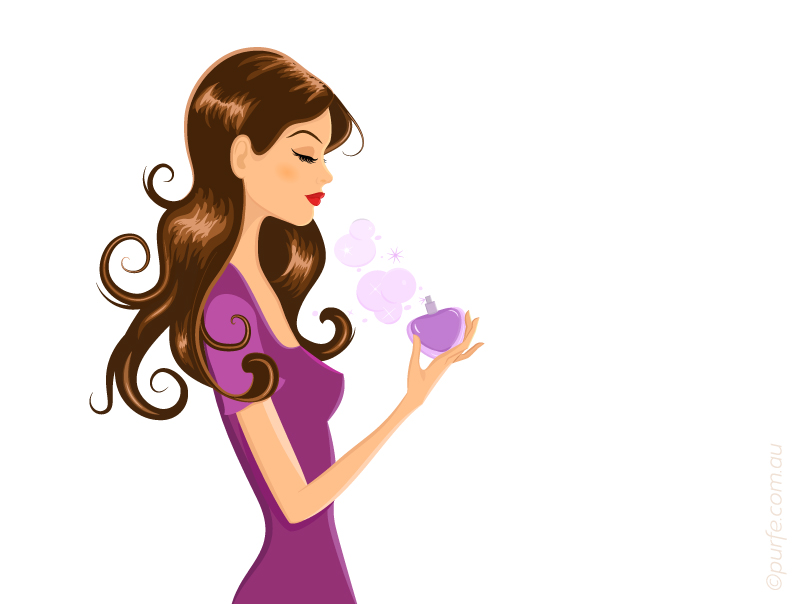
Fashion girl with perfume bottle. Vector Illustration

I’ve created some vector graphics and even that was more pleasant and easy on a pen tablet. Another reason to leave your mouse alone and do things differently?

Conclusion

Wacom Intuos5 lacks only one feature: it cannot make you draw better. But it certainly gets you to draw more!

Where to get one

If you are trying to find best deal on Wacom Intuos5 have a look on the Amazon offers. Wacom Intuos5 Touch Medium Pen Tablet that can be found there from $339*. Make sure you get “Touch” as there is a model without that functionality. Get a wireless kit for $36 extra as well if prefer to have less cables.

For Australian residents PC Case Gear sells them for $305* or you might give Static Ice search a go to see who else is offering them locally.

If you enjoy a bit of a technical details make sure to browse through official specs.

*information is relevant to a time review was written and might’ve changed.


You may also like to read about:
5 Best Free Apps to Organize Your Wardrobe

Who Owns Whom in Fashion

Did you know who owns Topshop and that Bottega Veneta and Alexander McQueen belong to a single company?

It’s not a big secret that many of the fashion brands are not independent. Some of them are a part of bigger groups while others are (in)directly controlled by the shareholders.

But who owns who exactly?

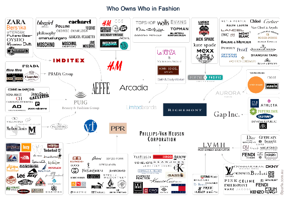
On this infographic I show relationships between fashion conglomerates and brands. You can see quite popular luxe brands together with some lower end ones.

iconography who owns who in fashionI must say that some of this information was a bit difficult to get and by no means have I claim the exhaustiveness of the data.

Therefore, if you have any details you would like to share it will be quite welcomed.


You may also like to read about:
Who Owns Australian Popular Fashion Brands

Simple Shoe Classification, Part 2: Toe Styles, Brogues

About a month ago I’ve posted a Simple shoe classification – a comprehensive guide for identifying men’s classic shoes.

Today I’m about to extend it a little. And firstly I am going to talk on a topic of a toe style.

Toe style

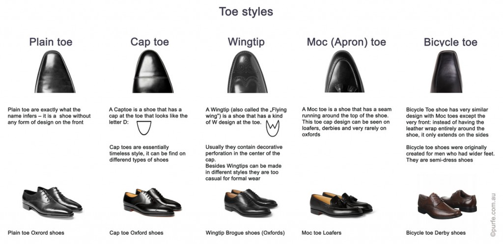
There are 5 basic toe styles each of them imply different degree of formality. Have a look at the table below that shows what each one is about.
table showing main styles of shoes' toes:plain toe, cap toe, wingtip toe, moc toe, apron toe, bicycle toe

Most classic and versatile are captoe and plain toe shoes, they are suitable for any attire and could be found on vast varieties of styles.
A grade down are Moc (Apron) and Bicycle toes. They are mostly used in semi-dress foot wear, on those occasions where shoe discipline is not so crucial (think relaxed Friday lunches).

And at the last comes Wingtip toe (my favourite one at the moment) which is most often worn with a casual style. Wingtip shoes usually have brogueing (perforations) as decoration.

Brogues

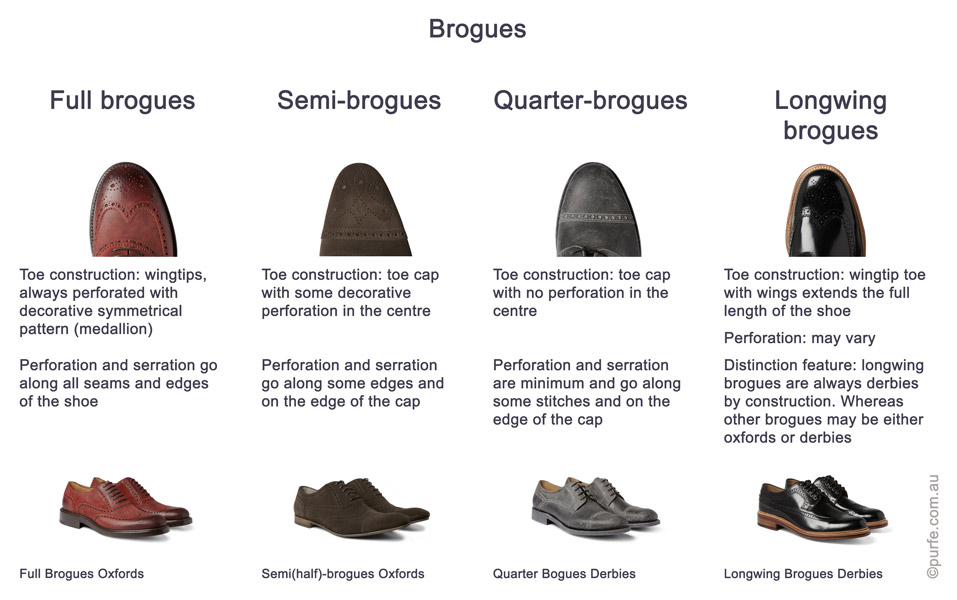
All perforated shoes are brogues either they are oxfords or derbies. By the amount of perforation and toe style brogue shoes themselves divide into 4 categories.

table showing main styles of brogue shoes: full brogues, half brogues, semi-brogues, quarter brogues, longwing brogues

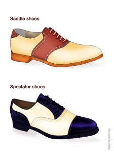
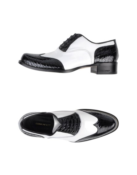
If oxford full brogues or semi-brogues have wingtips and cap toe (and sometimes the lace panels) in contrasting tones we can tell they are Spectator shoes.Fashion illustration showa difference between saddle shoes and spectator shoes

Not to be confused with another 2-tone low-heeled casual shoe – Saddle shoes!

These are usually plain-toe oxfords made in white or tan leather with a darker saddle-shaped piece sewn across the mid foot. The “Saddle” part is traditionally black, brown or red, although who could really stop shoemakers doing something new?

Well, I have expanded original Simple shoe classification a little bit to cover almost all types of men shoes by now. Hope you find it useful.


And remember, they say you can tell personality of 90 percent of all the people just by looking at their shoes. So, it could be even a psychological tool for those who master it.


On the pictures below there are some models from selected e-stores just to illustrate the idea and give you a hint what to look for.


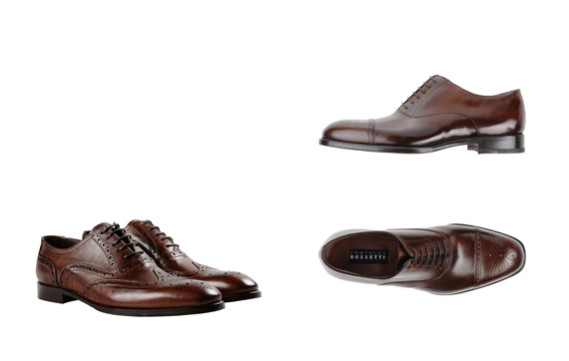
Brogues, Full Brogues, Semi Brogues
Leonardo Principi Dark Brown Full BroguesFratelli Rossetti dark Brown Semi Brogues

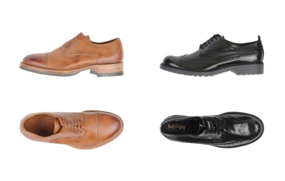
Quarter Brogues, Long Wing Brogues shoes
N.D.C. Made By Hand Camel Quarter BroruesMFW Collection Black Longwing Brogues

Black and white Spectator shoes
Dsquared2 Spectator Shoes


You may also like to read about:
Simple Shoe Classification. Part 1: Shoe Styles

Basic Principles of an Outfit Layout: Focal Point

My recent post about relations of peplum and pants has touched an important principle of an outfit layout – the subject of a focal point.

In fashion, like in art, focal point (centre of interest) is where the viewer attention is naturally attracted.
Proficient arrangement of focal points can turn a plain outfit into a good one. It is a sort of visual magic when a scarf thrown over a shoulder resuscitates the entire look. The question is how do you know what trick to use where.

Every garment independently of the outfit has its own centre of interest – it could be a collar, a pocket, a yoke, pleats, gatherings, you name it.
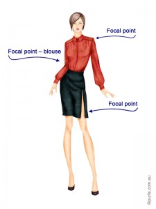
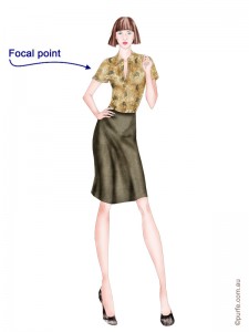
On the image below the shirt catches the eye and it is the focal point of this look. But both skirt and blouse has their own centres of interest – it is a slit and a yoke respectively.
fashion illustration of woman wearing red blouse with front yoke and skirt with slit

So, in an outfit the focal centre can be:
-a certain garment (blouse, T-shirt, shoes, shorts)
-a detail or accessory (collar, pockets, sleeves, brooch, bangles, and necklaces)
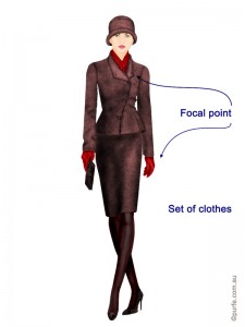
-a set of clothes (hat and scarf, scarf and gloves, shoes and skirt)

fashion illustration of woman wearing brown jacket and skirt paired with red gloves and scarf style

There are 4 basic approaches to emphasise something as focal point:
-by colour
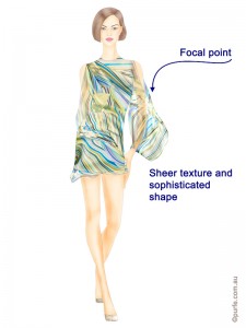
-by texture
-by shape
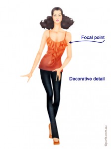
-by complex trimming or other striking elements.

fashion illustration of woman wearing silk dress with sophisticated sheer sleeves fashion illustration of woman wearing dark skinnies and bright top decorated with frills

The number of centres in an outfit can vary from one to as many as desired as long as they are hierarchically coordinated.

Multiple focal points add interesting complexity. The diversity and elegant balance of details get attention of viewers. Most of the times we don’t even know why, but we can tell there is something in that look.

At the same time there should be a clear connection between individual parts of the design. They should be sending the same image message.

The cohering elements of an outfit can be present on different levels. Every one of these is a big subject and deserves a topic of its own, so we’ll keep it simple here.

-Proportion: consider how to vary placement of garments so they articulate strong message and the outfit has its centre of interest. The size of focal point must complement the proportion of the garment (e.g. you might not be the only one who thinks that a big bow on slim evening dress looks ridiculous).
-Colour scheme: coherence on this level works best when one accent colour dominates the look and the others work to support and add interest to an outfit. Have another look on that red blouse above. That’s it.
-Shape: sophisticated and irregular shapes cause strong sensory responses so they must be balanced within an outfit to avoid undesirable effect.A decorative blouse with plan paints works well.
-Texture: textures influence our mood. We make assumption according to certain textures about age, personality, lifestyle, degree of sophistication. Textures are also perceived according to hierarchy. Smooth and glossy fabrics are catching attention first.
-Pattern and decoration: some of them are active and dominant while others are not so strong.

Let’s have a look on the example. Below, a light patterned shirt is teamed with a plain skirt in matching colour. This outfit is well-adjusted on the levels of colour, pattern and texture. Here all the attracting attributes of each level belong to the shirt and that makes the look balanced. It might be, however, lacking a certain degree of sophistication, but that’s easily corrected by adding accessories.
fashion illustration of woman wearing floral blouse and plain brown skirt

Getting a balanced look is not an easy task as it may seem. But as most of things, you get it with a practice. A good rule of thumb here is: if you are uncertain about something just make it simpler. The safest way to mix clothes in an outfit is to start basic, use one focal point, or one accent.


You may also like to read about:
Connecting Dots. The Importance of Intermediary in an Outfit
Cherry on the Top or Contrast Principle

How to Wear Peplum With Pants

This summer peplum is again on the top of the fashion wave! And according to the fashion weeks taking turns in northern hemisphere this embellishment will be a trend at least one more season.

Now it is presented in the most refreshing and outstanding way since its appearance – it is teamed with pants and shorts.
I find this tendency to be a great subject for a field study.

Close observation of peplum+pants combination on the streets, fashion blogs and catwalk photos lead me to a number of ideas.

Peplum itself is a dominant feature highlighting the waist-thigh area and pants in their turn are doing the same. So, put together they make lower body the centre of attention.

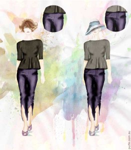
There are several ways to make the look more balanced. Fist way to reduce the number of glances towards the hips would be to wear well-fitted pants without any visible fly-fronts, fasteners, pockets and other distractive details. The minimal number of lines and visible details creates lean appearance.
fashion illustration demonstrated two identical women one of them wearing pants with side fastening the other with front one

Second option is to use long peplum. This will help to conceal fragile to attention area.
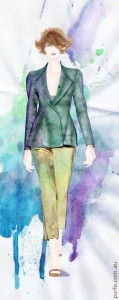
fashion illustration of woman wearing pants with long peplum jacket

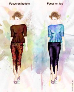
Another method to attain a light image is to shift a focal point to the upper body.

This can be done by using colour, pattern or accessories. A waist accentuated by peplum and plain top emphasize slim torso and drive attention to other areas.
Inverse also works. Patterned pants with plain top help to create desired silhouette and disguise lower body. The trick is that decorated surface attracts attention and at the same time provides a camouflage.

The right arrangement of decorative motifs and colour blocks become crucial in this situation.
fashion illustration of women wearing theirs peplum and pants outfits with focal point on top and bottom respectively

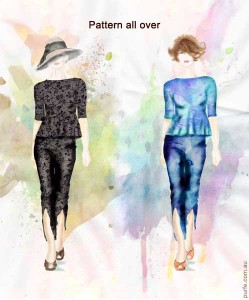
And the last, but not the least approach for the graceful peplum look is to use single-colour combination.
Add a pattern and we have even more streamlined silhouette.
fashion illustration of women wearing patterned  peplum and pants outfit


You may also like to read about:
How to Wear Crop Tops
Maternity Style Tips. Look Stylish when They Say You Can’t
Connecting Dots. The Importance of Intermediary in an Outfit