Right Pants Length: Flared, Bell-bottom, Wide Leg Pants

For the sake of convenience I’ll write about flared, bell-bottom, wide leg and any long pant with hemline wide enough to cover the shoe as Flared. Since they all obey the same length rules.

The flared trousers and jeans are very popular among women of different ages and body types. However, according to my personal observations almost 65% of women wear flared pants which are too short, and 15% wear the ones that are too long. If there was a fine for wearing incorrect length pants the Government would’ve solved quite a few budget problems in no time!

It worth mentioning that flared pants are very capricious and demanding. They can either make a whole look more slender or transform it totally opposite way.
The secret to get the first and avoid the second is to hem the pants correctly. The flared pants of the correct lengths will complement almost every body type.

Wide hem demands long length. They are just designed that way – with lots of fabric not only broadways but lengthwise as well.

The hem should almost touch the floor. It’s ok if they skim the ground. But for practical reason they can be just 0.3-0.5 cm off so they actually don’t touch the ground. Red carpet wearers can certainly make it into exact lengths with the help of their designers.
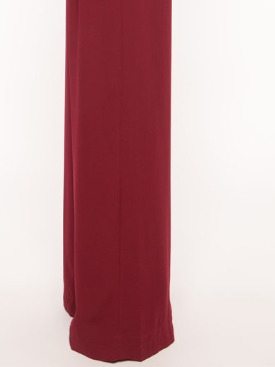
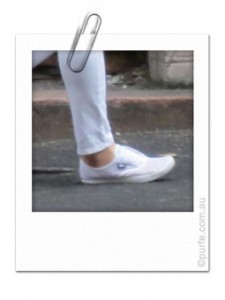
Wide leg pants floor length
Right length for wide leg pants

Ideally they should hide the shoe entirely. This does not mean that your stylish shoes will be out of sight. They will poke out when you’re walking or sitting down creating an intrigue for those trying to figure out what shoes you are actually wearing.

If for whatever you don’t feel comfortable with this arrangement, you might as well consider some other styles to wear. “Wear it right, or don’t wear it at all” saying has its place for this type of clothing.

Flared pants with flats

Full length flared pants looks great with high to medium heels. Yet, hemmed for flats or low heels they get creased breaks in the front. This could be fine with denim and rough fabrics, but on most dress and suit types it does look a bit awkward.

Thus, you may want to hem them at slant: longer at the back and sides and shorter at the instep. Such edge will produce a clean break in the front without compromising the length. At the same time this is more laborious job that takes time and that not every tailor would agree to do. It might also cost more than regular hemming as well, but the benefits you’ll get out of correctly hemmed flared pants are definitely worth it.
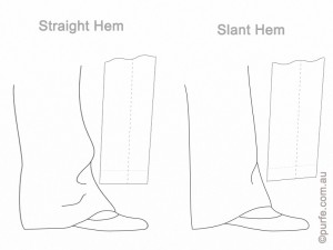
Illustration of pants with straight and slanted hems
Straight vs slanted hem

A point to be mentioned as well is that skinnies are not very captious of heels. The flared pants, on other hand, certainly are. And as long line created by flared pants is immeasurably complementing to almost every body type it is worth to scrutinize every cm of pants length and heel highs to get most of them. That’s true even if this involves extra spending on tailoring or getting a second pair to be hemmed at different length.


You may also like to read about:
Right Pants Length: Skinnies

Right Pants Length: Skinnies
The topic of right pants length came up while I was choosing pants for Christmas party outfit for my friend. She suggested to make a handy tutorial about this. Being a pants person for some part of my life I definitely accumulated a bit of knowledge on the topic. It did, however, seemed too obvious to write about. Can’t we all tell how pants should fit?

I parked idea on a side while one Friday night in the City I started to pay attention for girls in pants. Huge crowd of women swept past me wearing jeans, flared, cropped pants, skinnies of various colours and styles. Surprisingly, however, I could count those fitting well with the fingers of one hand. And that’s only taking into account the length, not even the style or fit. I was dazed. The need of a good article explaining the concept was obvious.

What is the Right Length for Skinnies?

I could count 3 ways women wear skinny jeans: tucked, scrunched around the ankle and cuffed. And, actually, there is one more. I do remember seeing a desperate attempt to make skinny jeans reach the middle of 11 cm heels. That was giving an impression of having hoofs. Quite unusual sight.

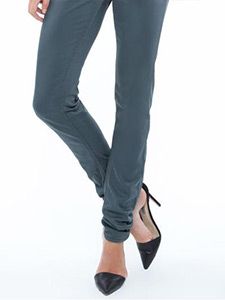
The version when pants stop at ankle is so rare that I didn’t even count it as “way to wear”. Meanwhile, it is the only right way to wear non-cropped skinny pants. They should hit at the ankle. No trade-offs.

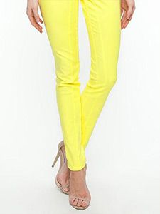
Skinny pants ankle length
The right length for skinny pants

And yes, after some hunting, I’ve spotted one with correct length. They could be about 1 cm longer for heels then those worn with flats, but no more than that.

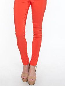
Skinny jeans, skinny pants, skinnies, woman, right length, correct pants length Skinny jeans, skinny pants, skinnies, woman, right length, correct pants length

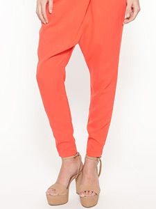
Most tapered pants are also obeying “ankle length” rule.

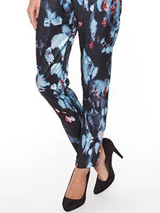
Skinny jeans, tapered pants, harem pants, woman, right length, correct pants length, tapered pants, skinny pants, pleat pants, woman, right length, correct pants length

But what about scrunching?

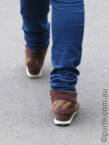
Well, it depends. I’ve seen very nice look with skinnies slightly scrunched at ankle. The main word is slightly. The other important detail is wearer’s figure, build. It was a quite a lean young girl with narrow hips and long legs. In other cases scrunching tends to break up a silhouette line and makes figure appear stumpy.

photo of wrong way to scrunch skinnies Skinny jeans, skinny pants, skinnies, woman, right length, correct pants length, scrunched skinny

Scrunched skinnies? No, thanks.

Long skinnies have great potential for shortening. Excess of length can be easily fixed, but its lack is a tricky thing to deal with.

Cuffed skinnies

It is one of the major sartorial crimes to cuff skinny jeans and pants to an ankle length. Shortened in that manner pants cry out loud they are not fitted properly (or trend is too original for me to appreciate).

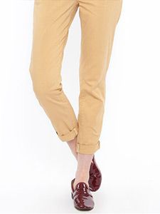
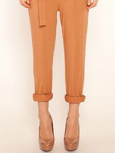
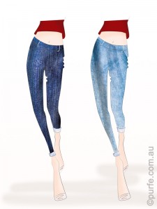
The only way to cuff skinnies is to roll them above the ankle to resemble cropped pants. Of course, made in such way cuffs should not bulge out with all its multilayered fabric glory.

Skinny jeans, skinny pants, skinnies, woman, right length, correct pants length, cuffed pants Skinny jeans, skinny pants, skinnies, woman, right length, correct pants length, cuffed pants
The right length for cuffed skinnies

Colour is another characteristic to think about. I’ve noticed that cuffs look best on light coloured pants where the difference between right and wrong sides of the fabric is not well defined so contrasting cuff does not break off the leg line.

fashion illustration of dark and light denim cuffed skinnies

Practical considerations

Now, before taking a pair of skinnies to the tailor let me mention couple of handy points.

Shrinkage. Any pants (especially denim and linen) should always be washed a few times before tailoring as they may shrink lengthwise. And then, few times more. And even then, many will still shrink up over the time. So it might pay to wait while fabric is settled.

Tapering. Initially skinnies are made to be tight enough at the ankle. However, shortening can make them wider around the edge. So the hem of the pants which is designed to be the narrowest and sexiest part of the jeans may start to jiggle around. Even an extra 2 cm of excess fabric may be enough to throw the whole look out of balance. So check it twice and ask your tailor if something could be done to slim the ankle if necessary.

To be continued.

Some pants shown in this article are available from The Iconic store at the time of publishing.


You may also like to read about:
Right Pants Length: Flared, Bell-bottom, Wide Leg Pants.

Maternity Style Tips. Look Stylish when They Say You Can’t

It happens that three of my friends are about to give birth, subject which is a very exciting on its own. But for me as an enthusiast style consultant it is also a chance to challenge my knowledge and sense of style. It is good to have a challenge anytime, and especially in such rapidly changing environment as a wardrobe of a pregnant woman.

Today I’m going to share one trick that can help to save not only “second-and-third-trimester” outfit, but also one that looks heavy and stout. I’ll put a bit of theory to explain the works.

Every day while processing new information we are constantly matching it to things we already know and seen, engaging our brain to look for reference points. We might pick only the meaning we can reference to and skip any further thoughts of it. It might be not the ultimate meaning, just one we came across, the one that looks right (all optical illusions are based on such perception anomalies, by the way).

Now, going from theory to practice and from abstract visions to women figures and clothing, it is primarily a shape (silhouette) that our brain is looking for. Therefore, if we think the figure lacks something from a quick glance over it, the task of make-believing bears heavily on clothes.

As I do not consider corsets and other instruments of torture as a solution what then should it be? Well, almost everything that creates strict, distinct lines which could be a reference point of shape for the brain.

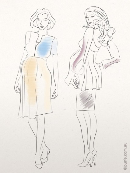
For example, one of my friends uses a cropped stiff corduroy jacket with usual “maternity” dresses. The dress made out of a floral jersey gently wraps the body, but the fabric itself is not heavy enough to define a silhouette. All this dress needed was a well-defined form and jacket provided it along with outlining right proportions.

The other friend of mine uses slinky skirts paired with wide, hip-length blouses and snug fitting shoes. Skirt and shoes act as “shapers” helping to emphasize the best features as well as serving the purpose and giving a reference point of the shape. That, at the end, is creating a balanced and attractive look.

vector fashion illustration of two pregnant woman one of them wearing dress and denim jacket, and other sheer loose blouse and tight skirt

Heavy fabrics that make gorgeous folds work the same: they do provide clean lines and create clear silhouette. Actually, it could even be accessories (belt, bangles, geometrical bag, a scarf tightly tied up) that help to change “stout and heavy” into “elegant and balanced”.

Try to look around yourself when you are in a big shopping centre and watch for pregnant looks. I’m certain you’ll see some “shapers” and give them a credit for style.


Colour of The Year 2013

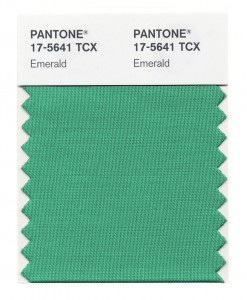
Pantone has revealed the colour of the year 2013. And the winner is Emerald, a graceful green-blue hue.

Pantone swatch of Emerald colour
Picture courtesy of Pantone

Well, this choice was quite unexpectedly anticipated as different shades of green were showing up across every fashion retailer since October. And more blueish green shall be awaited considering the jewel-toned colours took off on fashion runways for Spring-Summer 2013. Can bet a dollar, winter collections will be no exception.
Appropriate for every occasion as stated in the official report and, indeed, Emerald is not such overpowering hue as its predecessor Tangerine Tango is. It is versatile and will flatter considerably more people than orange. And that’s the best thing I like about Emerald: it looks as good on a background as it does being an accent colour.

So what to pair the Emerald with?

I suggest to wander away from traditional combinations of green, orange or red. Yes, they do work well together, but why not to try something just tiny bit different?
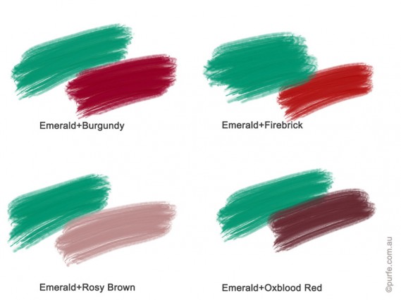
The rich redish-brown hues are perfect substitute for red shades. They are close enough to the classic, yet distinctive to be considered a specialty. For example, Burgundy, Firebrick, Oxblood Red or Rosy Brown are still vigorous and energetic, but more noble than plain Red or Pink.
Colour swatches of Emerald with Burgundy, Firebrick, Oxblood Red, Rosy Brown

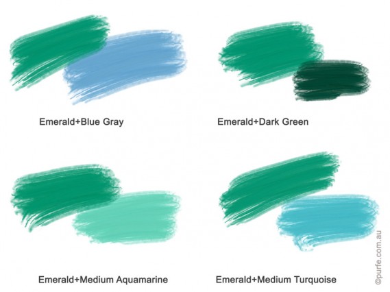
For subtle and airy look the analogous colour scheme will be a good choice (read using shades of green or blue with Emerald). I especially like how colour of 2013 looks next to Blue Gray (first swatch below). But try not to overdo it with greens unless it is St. Patrick’s Day.
Colour swatches of Emerald with different shades of blue and green

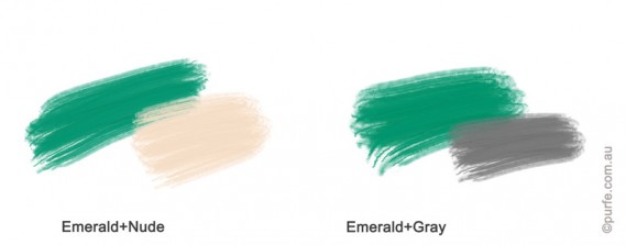
If I had to choose just two pairs, my personal favourites will be emerald with grey and nude. Imagine a jewel-green knee-length dress teamed with nude patent leather heels and half an inch thick belt. Elegant and crisp! *Shall I consider this to be my Christmas party outfit?
Colour swatches of Emerald with nude and grey
And don’t forget, we can always use textures to add some extra creativity into the emerald sets (e.g. leather and lace, or jersey and silk). With this trick even classic green + red will get another chance to shine.
One more thing to remember: green makes red hues appear brighter (as it is a complementary colour for red). In practice this means that people with a redish skin undertone might need to opt for green accessories rather than a full green gown (e.g. wearing green bracelets or an emerald scarf around the handbag, point is not to wear green shades close to the face).


You may also like to read about:
How to Coordinate Colours in Outfit, Designer’s Method

The Timeless Principles of Pattern Mixing

Every season style blogs are filled with reports of trendy prints and the ways to mix them for the perfect outfit.
There is a myriad of tips like “Look for patterns that complement each other” or “Limit patterns to two” and even “Leopard goes with everything.”
These might be great examples of what works, but in this article I will cover the logic behind it, why it works. And why it doesn’t when it doesn’t.

“So, what principles considered the base of a perfect pattern combination?” you might ask.

First of all, in a well-designed outfit you would straightaway notice the strong, active print (or a color, shape) that sets the theme. The other details are working to reinforce that. An outfit needs to be structured to make it easier for the viewer to perceive the parts of composition. A glance will go to one part after another, starting from the most active (accent) to the quietest and neutral one creating the feeling of agreement and consistency.
That’s why an outfit that contains two or more identically intensive patterns causes visual confusion. The observer will be switching between them unable to identify the main and the subtle one.
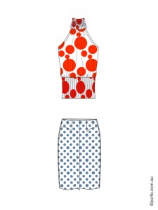
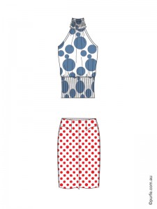
fashion illustration of top and skirt with equally intensive patterns

Two identically intensive patterns

At first glance the garments above are combined according to the basic rules of mixing patterns. The scale is right – polka dot on skirt goes well with large circles of the top. The color combination is fine, complementary hues are used. But something just doesn’t feel right, isn’t it?

That’s because they doesn’t follow the main principle of print mixing: to achieve the harmonious look patterns should be of different intensity.
Below are the rules that will help to identify which of two patterns is dominant.

The balance in pattern mixing could be achieved through

Levels of pattern coherence:

  • Size. Bold patterns are dominant over fine ones. That’s why they say “pair same patterns in different scale”.
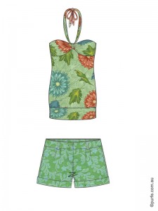
    fashion illustration of top and shorts with different scaled floral patterns
    Colorful floral print mixed with subtle organic pattern

  • Complex (structured) forms dominate over simple ones – paisleys are usually more eye-catching then dots. Other examples of potentially active prints include bold florals, detailed damasks or compelling geometrics.
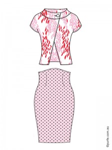
    fashion illustration of floral jacket and polka dot skirt
    Jacket’s floral print is more complex so it becomes the centre of attention for this set

  • Color saturation. Pure hues are more prominent then gradations – pure red stripes are more eye-catching then maroon ones.

  • Color temperature. Patterns in warm hues dominate the ones in cool.
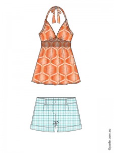
    fashion illustration of orange top and light blue shorts
    The warm orange top is dominating blue shorts

  • Color intensity. Tints dominate shades, the lighter color is getting the attention first.
    fashion illustration of dark top and light coloured skirt
    Light-patterned skirt paired with dark top

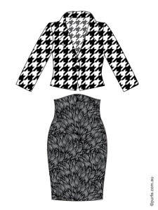
  • Contrast. High contrast objects look more fascinating then low-contrasting ones.
    fashion illustration of high contrast hounds tooth jacket and low contrast floral skirt
    Hound’s tooth jacket has higher contrast and dominates skirt

    These rules of pattern mixing work well considering all other characteristics are equal. In other words, between two patterns of equal size the lighter one will dominate. Between warm and cool ones of similar brightness conspicuous will be the one which is more pure and “warm”. Few visual examples below:

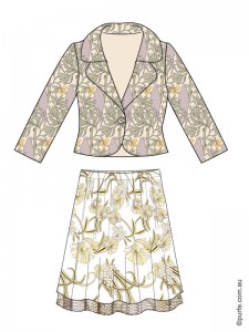
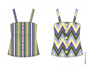
    fashion illustration of jacket slightly darker then skirt fashion illustration of two tops of the same design with different patterns
    Here are two organic prints both of a similar size. The dominant one is a skirt as it appears lighter

    Out of these two patterns zigzags are more noticeable due to a higher contrast and more complex geometry

    Q: If we have two dramatic patterns of a similar color shade and tone, would it be possible to wear them together and still have a balanced look?
    A: The answer is yes.
    Q: In that case which of them will be accent?
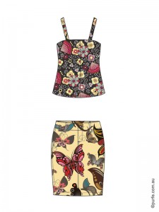
    A: Neither. Our vision is very good at noticing objects that stand out. Have one butterfly printed on the shirt and it will be the first thing everyone will see. Have a hundred of them and a tomato sauce stain and guess what people will look at. Same is here, we would need something to stand out. It could be plain color or accessory, e.g. nude shoes, a tan leather bag or big brown sunnies.

    Now, let’s get back to the example described at the start of the article and think how we can fix it.

    fashion illustration of top and skirt with equally intensive patternsprevious illustration with switched colour on patterns

    The set on the left feels a bit “undecided”. And indeed, it breaks the main principle of mixing patterns of different intensity. The polka dot, in spite of its size, is conspicuous by color while top’s circles dominate by size. So these garments are disputing on the level of color and scale. Two active prints are clashing and cause viewer “to jump” from top to skirt and back again while being unable to decide which of them has the priority.
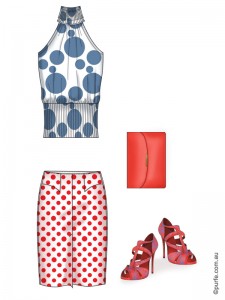
    If we simply swap the colors, – make a polka dot pattern in shaded blue, and circles on of the top in pure red, the harmony will be achieved. Now bigger and warmer print has full control over the smaller and cooler one.
    In real life where we cannot easily change the color of our clothes (tomato sauce aside). I would then suggest to find another pair to either skirt or top. Or, try to add the accessories to improve the look. More shopping to be done in any case!
    fashion illustration of top and skirt with equally intensive patterns with accessories supporting one of them

    It may seem difficult at first to keep all these things in mind. But it’s like learning to drive a car. When you first get behind the wheel you are overwhelmed by all the tasks you need to do at once: following the rules, checking the signs, keeping the speed and changing the gear (if you unlucky enough to have a manual). Once you get a bit of experience it becomes too simple. Suddenly you are a pro driver ready to show anyone few tricks, think you can do it with one hand while drinking a coffee with another. At the end, it is all about few simple rules and a bit of practice.


    You may also like to read about:
    How to Coordinate Colours in Outfit, Designer’s Method